Case Study: BioQuipBugs
Fixing the "bugs"
In early 2022, Royce Cumming was offered an opportunity he couldn't pass up. BioQuip Products Inc., was shuttered. This left the future of it's subsidiary, BioQuipBugs, the largest online bug retailer, uncertain. As a passionate entomologist and bug expert, Royce jumped at the chance to purchase and take over this unique business. Upon taking the reigns, he prioritized a complete overhaul of the company's website. Providing bugs to customers all over the globe, he knew how vital it was to have a modern, easy-to-use e-commerce system.
In surveying the competitive landscape, there were others that Royce admired but realized he could leapfrog them all with a new site. One email to Sefer Design Co. later, and we were off. In examining BQB's old site, two things stood out:
- the information was presented in a very simple, clear manner, and
- the aesthetic design was stale and not inline with modern standards

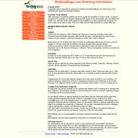
The existing site was loosely functional but seemed to have been designed twenty years earlier. It likely hadn't been touched since! In line with our philosophy, Royce agreed that the simplicity needed to remain. We would focus on creating a beautiful aesthetic layer while enhancing critical features.
Sometimes I felt like I had ridiculous requests because I wanted things to look and function in a very particular way, but Rob's attitude was always "I will find a way". No request of mine went unattended.Royce Cumming, BioQuipBugs
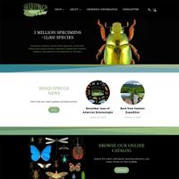
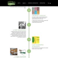
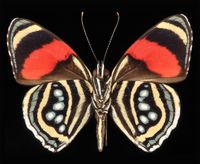
After a thorough design process with scientific illustrator Liz Sisk, we moved forward with a dark, almost forest-like aesthetic. Dark websites present their own challenges. It can be difficult to blend a color scheme on a dark background and keep text clear and readable. In this case the approach was necessary in order to highlight the incredible macro bug photography Royce provided. In the final design, we settled on a dark feel for shopping-related pages and a softer look for information-heavy areas of the site.
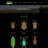
With the design finalized, we shifted our efforts to arguably the biggest project hurdle: data transfer. The existing product catalog included 17,000+ SKUs, with disparate groupings and formats throughout. Royce wanted to minimize the amount of data entry his team would need to do in order to complete the product catalog on the new site. After a thorough education on bug taxonomies, geographies, and more, we built a transfer tool that saved the BioQuipBugs team an immense amount of time entering and checking data. In the end, the new site has the complete product set, neatly organized and cataloged in such a way that makes administration simple and fast for Royce and his team.
Sefer Design Co. was an absolute pleasure to work with from beginning to end, despite me being very particular about certain functionalities. My products are complicated and how I wanted them displayed to my diverse customers was no easy feat, but Rob worked with me every step of the way to make my vision function beautifully! I know nothing about website design but everything was clearly laid out every step of the way for me. Which of course, with everything else going on during the rebranding of my company, was very helpful. Thank you Sefer Design Co. for helping to take my business to the next level!Royce Cumming, BioQuipBugs
With a new site in tow, Royce and his team are off to the races. The new site will allow his business to thrive in serving customers all over the globe quickly and efficiently. His infectious enthusiasm wore off on everyone involved. We love working with passionate and enthusiastic people and look forward to our next opportunity to do so.